
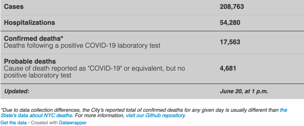
On the eve of Phase 2 reopening in NYC, New Yorkers have a lot to look back on and a lot to look forward to. Since the start of the pandemic, between 8 and 11% of confirmed and suspected NYC cases ended in death. At the same time, the total number of confirmed new cases was only 81 on June 19th and has been declining across the city. So as we ready ourselves for reopening, we need to take a look at the trends to answer that burning question: is a haircut worth the risk just yet?
One month ago: A tail of three cities
One month ago, when Mayor Cuomo extended NY “PAUSE” and postponed Phase 1 reopening to May 28th, New York got a signal that we were still in the danger zone. But why? Our R0, the rate of contagion spread, was consistently below 1 (the critical threshold). A look at the data shows that quality of our data and, thus, our ability to accurately estimate the true R0, varied widely by neighborhood.
Comparing just three different parts of the city — Chelsea/NoMad, Flatbush, and East New York — points to very different testing trends. These neighborhoods could be fairly described as high, medium, and low income, respectively. While Chelsea and NoMad (zip code 10001) saw the total number of tests per day rising from April 1 to May 20, Flatbush and East New York (zip codes 11203 and 11239) actually saw their daily testing rate *fall* during the same period. Although the number of positive cases dropped steadily over time in all three areas, the rate of change (indicated by the line graphs) for testing and positive test cases trend downward together in Flatbush and East New York. This suggests under-reporting of cases. The Chelsea and Nomad rates of change, by contrast, show an acceleration of testing and declining growth in positive diagnoses. With bigger sample sizes and more data points, we can confidently say Chelsea and Nomad had falling R0s.


Since Phase 1: More universal testing and better results
Today, looking back on the two weeks since Phase 1 began, there are sustained signs of improvement. Across our three sample zip codes, we saw total case levels flatten while total testing continued to increase, giving us confidence that our R0 was truly falling across the different locales.

The data indicate that targeted interventions in areas like East New York meaningfully boosted the rate of testing. Whereas testing rates hovered around 30 per day for all of April and May, for one day in June, shortly after Phase 1 reopening, testing jumped to about 150.

These signs bode well. So should we be encouraged? On balance, yes. Even in our biggest recent gatherings, the Black Lives Matter protests, protesters have had each other’s backs, wearing face masks and gloves and offering hand sanitizer. There may be pockets of regression as Gen Zers flock back to bars sans masks, but with new cleaning and hygiene norms everywhere, I remain cautiously optimistic that our city will heal.
Today: Still worth taking a different “PAUSE”
Despite the positive recent trends, the aftershock will be felt for a long time. Nearly as many New Yorkers have died from COVID-19 as live in the 10001 zip code. But very few of these deaths were in Chelsea and Nomad. Flatbush experienced hundreds of deaths, and East New York experienced seven times the number of deaths per 100,000 that Chelsea and Nomad did.

It is worth pausing to think through what exactly needs to change in order for the darkness of a pandemic case map to not reflect the darkness of neighborhood residents’ skin.

